Revalidatiecentrum De Hoogstraat, 2021
A personalized intranet.
De Hoogstraat approached me with the initial request to design a new intranet, because their current intranet would quit in 2023. Although this was their motivation to get a new intranet, during our first meeting I found out the company had more obstables than they initially let on. The design was outdated and they were under the impression that many employees were failing to use the website because it wasn't user-friendly. Also, the company felt that the employees weren't receiving the important internal news. My first task would be to find out how much of their assumptions were true.

Let's investigate
My research discoveries.
Using different interview techniques and sending out surveys I received opinions from 50 employees. When analyzing this data I found out the company was right about some things, but wrong about others. Many nurses and doctors at this rehabilitation center explained they're busy treating patients all day and that reading the company's daily news is not high on their priority list. However, the assumption that the intranet is barely used was false. Even the employees who are busy did admit they use the intranet daily, even if it's for one minute to read the news' headlines. The reason for this is that the laptop opens up with intranet, so they are confronted with it, which is a good thing. The company was however right about the fact employees had difficulty using the application.
How do I fix these problems?
My solution.
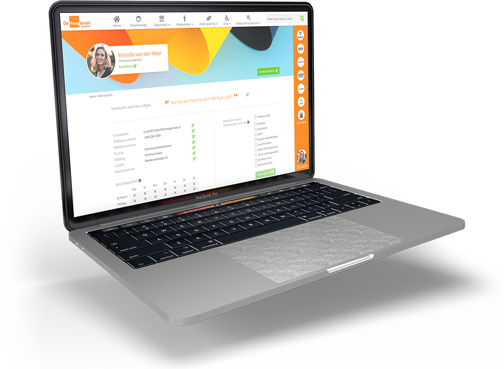
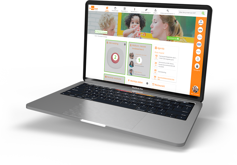
Because the intranet is the company's main information source it contains a lot of content, which creates irritation when you're in a hurry. The solution I came up with is to create an intranet where each user can choose what information they find important. The benefit of a personalized homepage is that the user doesn't spend the little time they have on reading irrelevant information. This way it's more pleasant to use the intranet and the employees are more likely to read the company's important or pressing news items.
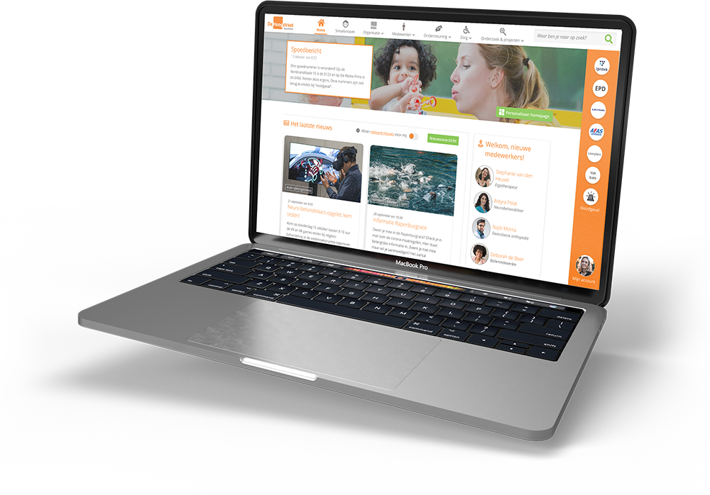
By using widgets the user can easily add or remove subjects from the homepage and the news section can also easily filter out the unwanted categories.

Does my solution fix the problem?
Confirmation using usability tests.
By conducting usability tests twice (with the lo-fi and hi-fi prototypes) I optimized the design to fit the target audience. Personalizing the homepage was especially paid attention to; I wanted that experience to be intuitive for the experienced internet users, but also for the digital illiterates.
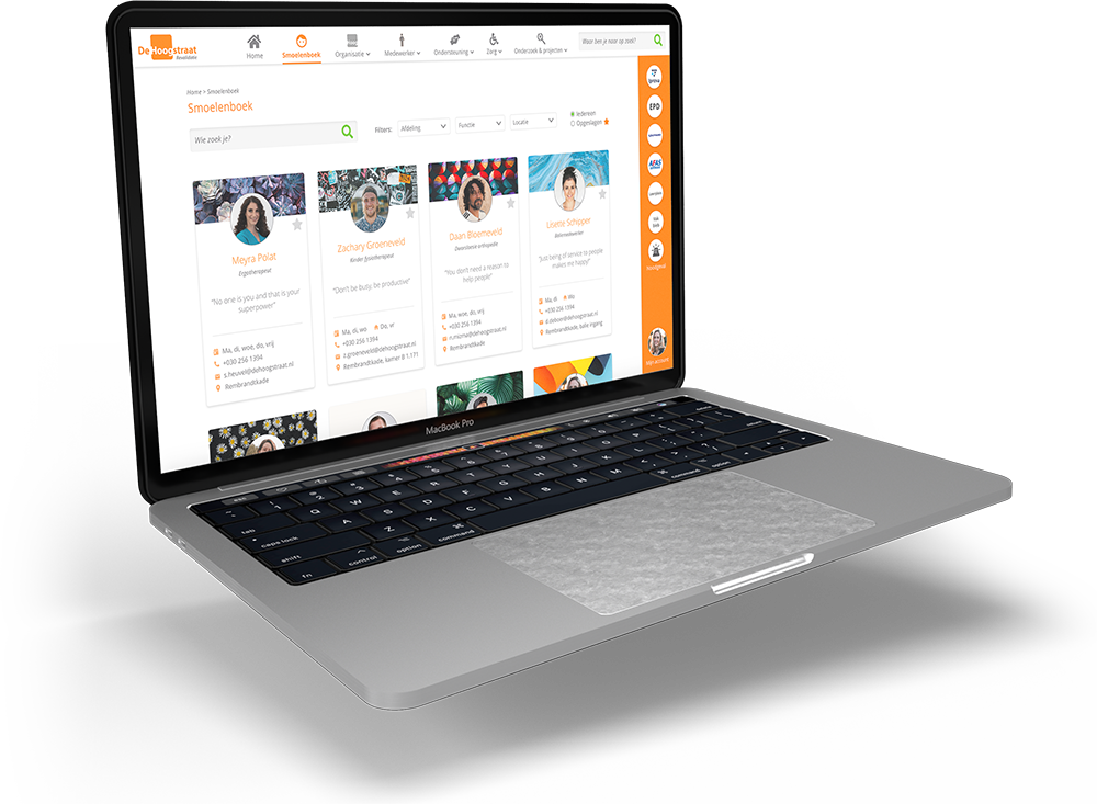
I also tested the overall usability of the system; could the test subjects carry out their every-day tasks like using the "Smoelenboek" or finding a document using the search function? Luckily the tests confirmed that my design worked well for them. The client was very happy as well and are in the process of developing my design.
Excited about what you see?
I am very interested to hear what you think, whether it’s about my previous projects, potential future projects, the opportunity to work together or even if you want to tell me about your favorite movie. I am already looking forward to reading your message!


